This article applies to Microsoft Windows XP and to Windows Forms applications built using the .NET framework version 1.1 and Microsoft Visual Studio 2003.
I don't know about you, but I have historically found it pretty frustrating to control icon usage in my Windows Forms applications. Icons are used in a lot of different circumstances: in a form's title bar, on the task bar, in the system tray, on the desktop, in folder browse dialogs, in the add/remove programs control panel application, etc. And despite the generally excellent quality of the documentation you get with Microsoft Visual Studio 2003, the documentation on how Icons are consumed by Windows Forms applications and presented in those different circumstances is more or less completely lacking. I got fed up with not knowing what the story was, and this article is the result.
A reader asked for a quick-reference table at the top of this document, showing the default icon versions used by Windows Forms applications in different circumstances, so here it is. Detailed explanations are provided below if you're interested
| Circumstance: | Icon Version: |
| Control Box | 16x16x256 |
| Taskbar | 16x16x256 |
| Notify Icon | 32x32x256, shrunk down (see below) |
| Desktop Shortcut | 32x32x256 (Normal sized icons) |
| 48x48x256 (Large sized icons) | |
| Add/Remove Programs | 16x16x256 |
| Folder Browse dialog | 16x16x256 |
Here are a few important things you need to know about Icon files (.ico files), that are not immediately obvious, and are not well explained in the Visual Studio documentation.
First is the fact that an icon file (.ico) is not itself a bitmap; it is a collection of bitmaps, each one at a different size and color depth. For example, by default the App.ico file that you get from the new project wizard contains a 32x32 pixel, 16 color bitmap (referred to as 32x32x16), and a 16x16, 16 color bitmap (16x16x16). This is important because a) Windows and Windows Forms Applications want to use different size/color combinations in different circumstances, such as the ones listed above, and b) not knowing the rules is the source of most people's frustrations with icons.
Being able to put different versions into the same .ico file allows you to manage many versions of the same picture in a single icon resource. By associating that single resource with your application, you enable Windows and Windows Forms to find the best bitmap for any particular circumstance without you having to do any special coding.
Windows supports icons of arbitrary size (they don't have to be square, even). You can create a 100x17 sized icon if you really want to, although I'm hard pressed to think what that might be good for. Windows supports three color depths as well: monochrome, 16 color, and 256 color. As far as I can tell, monochrome icons are mainly used for cursors. As cursors are not the focus of this article, I won't spend any time talking about them. 16 color icons are mostly a holdover from the earlier days of windows, before everybody had high-color screens. If you're writing an application for a wide audience, you should probably go to the bother of having 16 color versions of your icons in the off chance that someone with a really lame display uses your app, but for the most part if you create pretty, 256 color versions of your icons, those are the ones that will be used.
To find out how Windows XP and Windows Forms applications make use of the Icon resources embedded in your application, I ran some tests. I started with a blank Windows Forms application, and edited the "App.ico" file that the new project wizard creates for you. To that file, I added bitmaps for all the supported sizes, at both 16 and 256 color depths. The total list of versions in my test App.ico file is:
Each of those 8 bitmaps is a yellow field, with text indicating the size
and color depth, and two blocks of color for testing the transparent and
inverse-video palette entries that the icon editor gives you. For example,
here is my 32x32x16 bitmap as it appears in the icon editor:
Having done all that, all I had to do was add a NotifyIcon control to the form, and then set the App.ico file as the icon resource for both the Form and the NotifyIcon. Not needing to write any actual code, I compiled the app to see what would happen. By having a comprehensive set of bitmaps in my App.ico file, and by making each one label itself as to which version it is, one can then tell simply by looking which version is being used in any given circumstance.
The first time I ever tried to make my own icons for a Windows Forms application, it was a nightmare. Partly because information such as is in this article was missing from the documentation, but partly too because the Visual Studio icon editor does not make certain fundamental things obvious:
We've already talked about .ico files being a collection of bitmaps. By default, the Icon Editor shows you the 32x32x16 version. To access other versions, right click on the blank area outside of the drawing canvas. You'll get a context menu, near the bottom of which is a sub-menu labeled "Current Image Types". If you go there, you'll see a 16x16x16 version listed as well. If you select that item, the icon editor will display it for you to edit.
To add additional versions, right click as before but choose the "New Image Type" command. You'll get a dialog showing you all the standard size/color depth combinations. Select one to add it to your .ico file; the icon editor will switch to that version for you to edit.
After taking a careful look at which specific bitmaps are used in different circumstances, I found one big surprise: Windows uses and renders icons differently depending on both the desktop style the user is using (Windows XP vs. Windows Classic), and at different sizes depending on the font size the user has selected under Display Properties->Appearance. The specific differences by style and font size are discussed in the sections below.
The easiest issue to tackle is color depth. In every situation I looked at, Windows and Windows Forms applications default to using 256 color versions when they are available. That is, there were no situations where a 16 color version was used when a 256 color version was available. If a 256 color version is not available at a particular size, then the 16 color version at that same size will be used instead.
This is probably a good thing, as you can certainly make prettier icons with more colors to work with, but makes it somewhat surprising that the Visual Studio icon editor defaults to working at 16 colors. Then again, all of the computers I have access to for testing run at greater than 16 colors, so it is not surprising that Windows and Windows Forms never used the 16 color versions; my understanding is that if I did test on a screen that was only running at 16 colors, that Windows would use the 16 color versions.
Unless your app uses a borderless form, it will have a title bar, and on the left side of the title bar is the form's control box, which is used to access the menu of actions such as Minimize, Maximize, etc. The control box icon is rendered at whatever size is necessary to accomodate the height of the title bar. The title bar height, in turn, depends on the font and font size that the user has selected under Display Properties->Appearance. For the default setting, the Control Box icon size is 16x16 pixels. When using the "Large" font setting, the icon is rendered at 18x18 pixels. And when using the "Extra Large" font setting, the icon is rendered at 22x22 pixels. However, Windows uses the same 16x16x256 bitmap in your .ico file to generate these other sizes. It does so by stretching the 16x16 version, which creates unsightly jaggedness in the stretched result. Shown below is the same Control Box icon, rendered once at 16x16 pixels, and then again at 18x18 pixels:
| 16x16 pixels | 18x18 pixels |
 |  |
Notice the blocky appearance of the "256" at 18x18 pixels, due to stretching the 16x16x256 bitmap. There isn't much you can do about this, because the final size will depend on the user's settings. The best you can do is to design bitmaps that use smooth color changes, and avoid a lot of high-contrast edges that will become blocky when stretched. Notice how the final color of the blocks of transparent and inverse-video pixels depends on the title bar colors underneath the icon. More on that in the Transparency section below.
Unless you set your Form object's ShowInTaskbar property to False, your application will have a button on the taskbar. That button's icon is exactly the same as the one used for the control box: the 16x16x256 version, potentially stretched to accomodate the user's font size, because font size affects the height of the taskbar.
| 16x16 Taskbar | 18x18 Taskbar |
 |  |
If you add a NotifyIcon control to your application's Form object, then your application will display an icon in the tray area of the taskbar. The rendered size of the notify icon is the same as for the Control Box and Taskbar icons: 16x16 pixels, potentially stretched to accomodate the height of the system tray, which is dependent on the height of the Taskbar. Oddly, however, Windows does not use the 16x16x256 bitmap for this circumstance; it uses the 32x32x256 bitmap by default, and squashes it down to the required size. I can think of no particularly good reason for this difference--using the 32x32 version for the notify icon, but 16x16 for taskbar and control box--but there it is.
| 16x16 Notify Icon | 18x18 Notify Icon |
 |  |
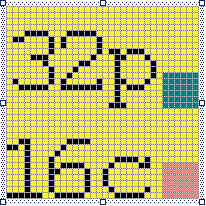
Notice that the text on my 32x32x256 icon is barely readable when shrunk down to 16x16 size. The same will be true for any one-pixel-wide details you include in your 32x32x256 bitmap, unless you are very careful about where you put them. The reason for this is clear: a 16x16 bitmap has only one-quarter as many pixels as a 32x32 bitmap. Consequently, three-quarters of the information in the 32x32 bitmap is thrown away when shrinking it down to 16x16. What to do about it is less clear.
To get a more optimal appearance for your NotifyIcon, you need to know
which pixels out of the 32x32 bitmap are the ones that will be displayed at
16x16 size. Fortunately, the mapping is straightforward. Windows throws out
all the even-numbered rows and columns, and keeps what's left. Shown here at
double-size is a 32x32x256 bitmap, where the black pixels are the ones that
will be seen when the bitmap is shrunk down to 16x16 on a NotifyIcon, and the
actual NotifyIcon image that this bitmap turns into in the system tray:
Before:  ...and after:
As you can see in these two images, the black pixels in the 32x32 image are
the ones that are actually displayed at 16x16 size. The yellow has
disappeared because the even-numbered rows and columns are thrown away.
Pixels in the even-numbered rows and columns are important for the appearance
of desktop shortcut icons, but are irrelevant for NotifyIcon objects.
If your application's setup program or the user creates a desktop shortcut to your application, the results depend on whether the user's desktop is set to use normal-sized icons or large icons. For normal sized icons, Windows uses the 32x32x256 version. For large icons, it uses the 48x48x256 version. If you have not provided a 48x48 version, Windows will use the 32x32 version and stretch it up to 48x48. As with the Control Box and Taskbar icons, the results of stretching a bitmap are generally sort of ugly, so take the time to design a true 48x48x256 bitmap to be used for desktop shortcuts.
| Normal Size | Large Size |
 |  |
As you can see in the above two pictures, when rendering desktop shortcuts Windows draws a small arrow glyph on top of your icon, to indicate to the user that the icon is a shortcut to a file, and not a file itself. This glyph resides in the bottom left corner of the icon, covering an 11x11 pixel region for normal-sized icons, and a 16x16 pixel region for large-sized icons. When designing an icon to represent your application on the desktop, try to leave this region unused, or at the very least, don't put anything that is visually important to your design in that lower left corner.
If you create a setup program for your application (a setup.exe or .msi installer file), then users can manage your application by means of the Add/Remove Programs control panel applet. The icon used for your application in that circumstance is the 16x16x256 version, defaulting back to 16x16x16 as usual if there isn't a 256 color version.
This circumstance is when the user is browsing for files in a tree-view control. You can see an example if you right-click on your desktop, choose New Shortcut, and then click the Browse button in the Create Shortcut wizard. Here, Windows uses the 16x16x256 icon, shown at normal size.
The icon editor, in addition to the 16 or 256 colors it gives you to draw
with, provides two special palette entries as well. In the color palette,
they are indicated like this: ![]()
The first one, with the greenish color in it, is the transparent color entry. The second one, with the pinkish color in it, is the inverse-videl entry.
The transparent palette entry is always rendered as transparent, and as you would expect, ends up showing whatever would otherwise be behind the icon. The behavior of the inverse palette entry is to literally invert the color values of whatever background pixel(s) are at those locations. That is, if an icon pixel using the inverse palette entry is displayed over a screen pixel with a color of RGB 100, 255, 128, then the user would be see a color of RGB 155, 0, 127 at that pixel.
All of this information about how Windows and Windows Forms applications use icon resources certainly gives rise to guidelines about how you should create your icon bitmaps. My recommendations are as follows:
 ...and
after:
...and
after: 
If you have any comments, suggestions, or corrections to offer about this article, please don't be shy! E-mail them to me at cloister(at)hhhh(dot)org In particular, there is the whole issue of 32 bit icons, and any exploration of this subject under Windows Forms 2.0 (a.k.a. "Whidbey"), or on the forthcoming Windows Vista release. If anyone happens to have some pointers to information about winform icon usage in those situations, I'd love to know of it.